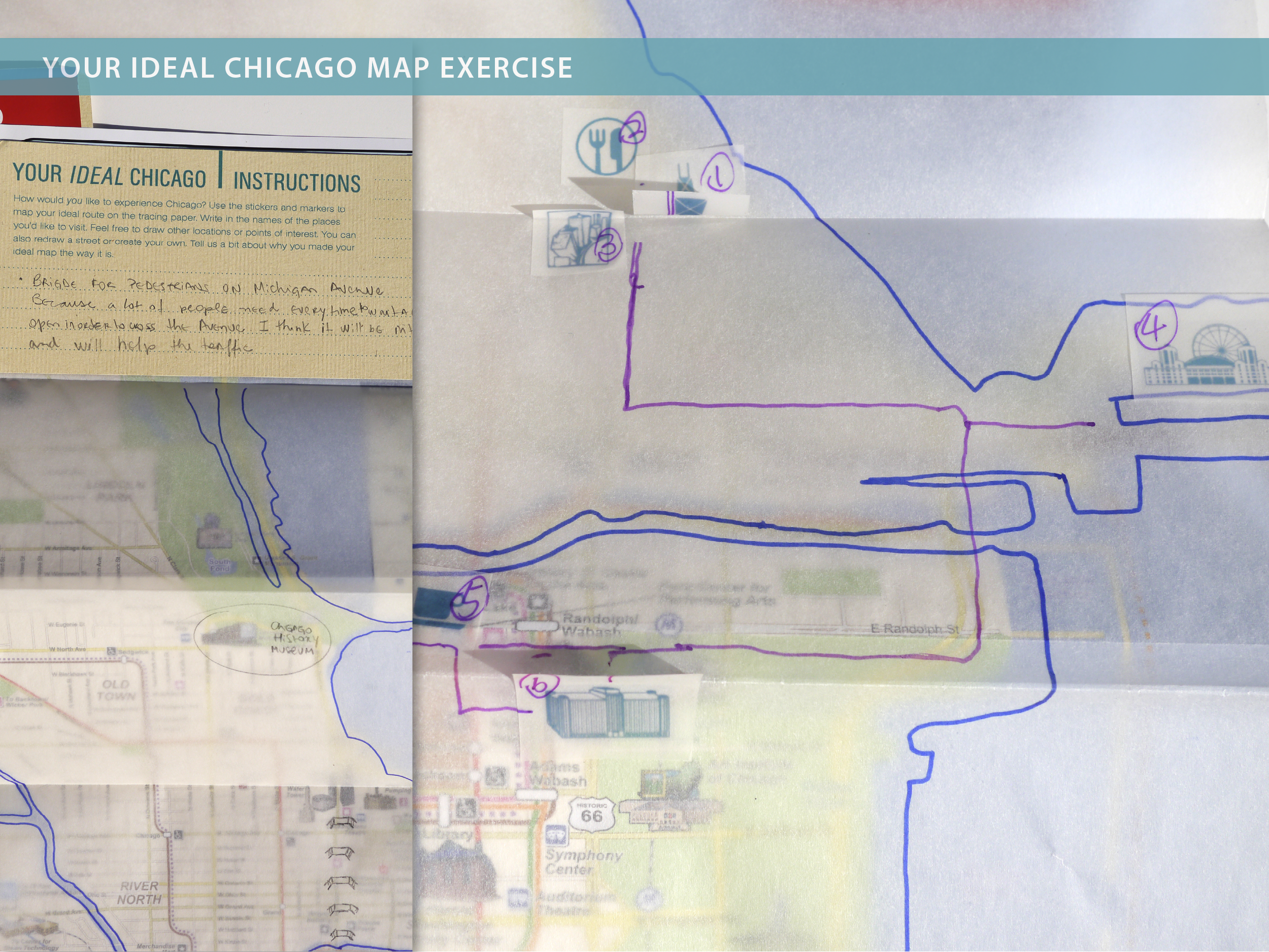


(to view image larger, please click on the upper right + icon)
This project aims to explore and understand how first-time visitors to Chicago navigate around an unfamiliar city. We look to improve the travel experience by analyzing the resources and modes of transportation that are available to visitors today. The project developed some implementable concepts with existing infrastructure constraints in mind.
Project Team: Yu Cui, Omihito Matsushita, Chia-ling Yu
Faculty Advisor: Yadira Ornelas
Key Role: research, lead team works, developed protocols, conducted interviews, cultural probe kits creation and production, presentation design.

The team first looked at different types of visitors that travel to Chicago. We decided to focus on Foreign Visitors, Family Travelers, and Short-term Stay Visitors who potentially have more needs.

The team researched different modes of transportation that visitors may use to get around, where we identified pros and cons for each.
The team also researched into Chicago tourism, visited tourist center, attractions and studied background information on current public transportation system.

The team observed several Chicago Transit Authority (CTA) Train and Bus locations, focusing on different touch points such as purchase point, platform point and on board. In addition, we focused on how the physical environment, communications and people's interaction play in part of the navigation.

Three user experience maps (Traveler, CTA Train and CTA Bus) were created to analyze the contextual findings and identify areas for improvement.

We developed a cultural probe kit and deployed 8 kits with 9 participants.
Gender:
2 male
7 female
Ethnic Group:
3 American
2 Chinese
2 Japanese
1 Indian
1 Brazilian

The kit included following:
Activities:
1 instruction / check card
1 field day journal
5 postcards w/question on back
1 Chicago visitor's map with overlay
1 flickr photo upload instruction card
1 cultural artifact question card
Helping Tools:
1 compass (cultural artifact)
1 travel pouch
3 color markers
1 pen
3 sheet of stickers (emotions, attractions, directions/activities)

From the experience maps and field observation, the team categorized findings related to travel in the following areas.
- Map
- Signage
- Ride
- Factors
- Schedule
- Visitors Barrier
- Guidance
- Ticket
- Orientation
- Environment

Focusing on 3 areas:
- Rider Experience & Expectations
- Navigation Hub
- Environments & Factors

Access to visitor's guide, where one can find information for attractions, restaurants, etc. Visitors can print a customized, just-in-time map, with coupons and clear step by step direction. Also, buy fare card and return unused fares all at the same large screen touch interactive kiosk.

This concept came from an insight that the advantage of a bus is the easy on/off, a bus rider is able to look outside the window and decide to get off on a whim if he/she sees something interesting outside.
What if there are specific visitors/tourists bus routes that only stop at a specific interest based locations? Like a bus for only restaurants/bars/clubs; a bus for art/cultural attractions; a bus for tourist/entertainment attraction; all loop around and have a common hub where visitors can transfer between different buses easily. A more focused travel experience that can still be spontaneous, and time saving for travelers with a tight schedule.

Street names don't mean much to visitors that are not familiar with the city. A large visual light board displaying the bus route with major attractions/establishment noted below each stop will help reduce visitors' anxiety level and make them more at ease for riding the bus.

Contingent Services/Partnerships that may aid visitors' navigating experience.
